Choosing the right colors for your custom clothing can be tricky because some colors might not be as vibrant if you don’t take certain things into consideration.
Now, this might sound like a hassle, but you shouldn’t get discouraged because there is an easy solution to everything. Here is everything you need to know about colors and printing to make your custom clothing perfect! According to Printful, you also need to be sure that the colors you choose are accurate to how they will look in real life.
Consider the Guidelines First

Depending on which printing company you work with, if you want to get your colors right, you have to check on their guidelines first. Printing companies can show you some tricks and tips so that you can achieve your desired results.
Some fabrics work great with certain colors, while others might have some issues with the ink. Generally, natural fabrics work the best when it comes to printing, but you should consult with the guidelines available by the printing company.
In some instances, you might view the lightning on your computer differently than how the printing company sees it on their computer or screen printing tab. In such instances, a reliable printing company can assist you.
They can give you expert advice on how to proceed with the color combinations for your custom clothes. In other cases, you can preview your color combinations more accurately before the printing process, but not all printing companies have this feature. In general, to get the best color results for your printed garments, you should use the design software tools provided by the printing company, follow their guidelines, and ensure that your screen is calibrated accordingly for accurate color display.
Check Your Screen Settings

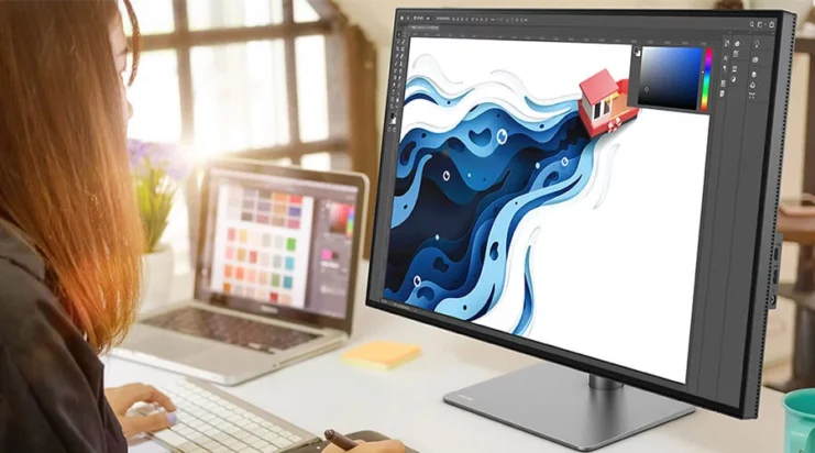
There are many types of computer screens out there, but color display mostly comes down to your screen settings. If you want to be sure that your colors look the same while you are designing for someone else’s screen, you can always share your design and see how the colors look.
Send your design to your phone and see if the colors look the same, or send it to friends and family and check out how it looks on their devices. This way, you can get a more accurate perception of the colors.
Remember that you have to look at your screen straight-on and ensure that you don’t have any bright or dark settings in place or that other lightning conditions affect your perception. Keep everything in the middle when it comes to settings and ensure that other apps don’t interfere with your display.
You should never choose the colors for your custom clothing hastily and without checking out your screen settings. Even if you get the color combinations right, you might have a false perception of those colors due to your settings, and the end result will not be what you want.
Designing custom clothes can take some time, but to get the best results when it comes to colors, you should check your project a couple of minutes after you finish it so you can rest your eyes. This way, you can spot mistakes better and get a more accurate overview of your color choices.
Get an Eye Exam
If you fail to get the colors right for your custom clothing, regardless of your screen settings and the printing companies that you’ve worked with, get an eye exam. Some people simply perceive certain colors more vividly, which can affect their design process.
Other people are color-blind. Regardless of your medical circumstances, you can follow your doctor’s recommendations to continue your custom clothing design process more efficiently.
Consider Your Audience

Whether you want to create custom clothes for yourself or others, there are still some color rules that you should consider to get the best results. Now, this doesn’t mean that you shouldn’t use pink for men’s clothes or anything of the sort, but rather you have to think about perception. For example, women and men don’t perceive colors in the same way.
If your target audience is centered more around women, consider this: women can distinguish different shades of red more quickly than men, while men perceive poor contrast better. If you design clothes for yourself, things are even simpler. Go with your favorite colors and let your imagination loose – but avoid color mismatches.
How to Avoid Color Mismatches

The general rule when it comes to printing custom clothes and picking the right colors is to avoid using the same ink color with the same color of your fabric. If you do this, your designs won’t stand out and will look unprofessional.
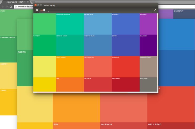
Instead, you should focus on complementary colors, such as red and green, yellow and purple, and blue and orange. In other instances, you can go with black and white, green and black, red and white, and other easy combinations that you can’t go wrong with because they work so well together.
Many color combinations can lead to a unique look as long as the printing comes out exactly how you previewed it on your screen. In some instances, heat transfer plays a major role in how the colors look.
Printing companies have their own pallets to choose from, and their printers might work with different inks than others. In this case, you should consult with them directly to get advice on the color of your custom garments.
Deciding on Colors Based on Where You Travel
Lastly, before you create your custom clothing items and decide on the colors, consider where you will wear these items. Brighter colors don’t absorb heat as darker colors do. So if you want to create custom clothes that you want to wear in the summer, opt for lighter colors instead of darker ones.

